
Azure cloud cost management is the practice of using Microsoft Cost Management + Billing, along with exports, tagging, budgets, and Power BI, to analyze, allocate, and reduce Azure spend at the organization level. The native tools cover cost analysis, budgeting, and alerts out of the box. They do not, on their own, produce a dashboard an executive can open and understand in thirty seconds. That gap is what this guide closes: how Azure’s export feature works, how to configure a recurring export correctly, and how to turn the resulting raw files into a dashboard that survives a board meeting.
If you have ever opened the Azure portal’s Cost Analysis view during a leadership review and watched everyone’s eyes glaze over at a wall of resource-group line items, this is for you.
This guide is written for the FinOps engineer or cloud architect who already has Azure Cost Management turned on and understands the basics of subscriptions, resource groups, and tagging, but has never actually wired the export feature to a working Power BI report. It skips the “what is the cloud” explanations and goes straight to the configuration screens, the schema decisions that actually matter, and the dashboard structure that survives contact with a real leadership meeting.
What Is Azure Cloud Cost Management?
Azure Cloud Cost Management refers to the combined set of practices and native Azure tools (Cost Analysis, Budgets, Advisor recommendations, and Exports) used to gain visibility into cloud spend, allocate it accurately across teams, and act on optimization opportunities. Advisor specifically analyzes resource utilization and surface rightsizing, idle-resource, and commitment-purchase recommendations, functioning as the “what should I do about this” layer that sits alongside the visibility tools covered in this guide. Teams already working inside Azure Monitor or Log Analytics can also reach Cost Analysis directly from a workspace’s Overview page, which is a useful shortcut if cost investigation starts from a monitoring alert rather than the billing account. It sits inside the broader Microsoft Cost Management + Billing suite, which is included with every Azure subscription at no additional cost.
The practice has three layers that matter for this guide:
- Visibility: seeing what you spent, broken down by subscription, resource group, service, or tag.
- Allocation: attributing that spend to the business unit, project, or team that generated it.
- Action: doing something about the parts of the bill that represent waste or unrealized discount opportunity.
Most teams get good at layer one within the first month of using Azure. Layer two takes a deliberate tagging strategy. Layer three is where most organizations stall, and it’s also the layer a dashboard alone cannot solve, a point this guide returns to later.
Microsoft’s own Cost Management product page lists five core capabilities: Copilot-assisted summarization, cost analysis, budgets, cost alerts, and cost allocation, with exports listed as a sixth capability specifically for “custom reports” and integration with “other business systems.” That’s the feature this guide is built around.
This also maps cleanly onto the FinOps Foundation’s own framework, which describes cloud financial management as a cycle of Inform, Optimize, and Operate. Cost Analysis and dashboards live in the Inform phase. Rightsizing and commitment purchasing live in the Optimize phase. Governance policies and ongoing monitoring live in Operate. A common mistake is treating a dashboard project as the finish line rather than the entry point into the cycle. The dashboard is what makes the Optimize phase possible in the first place, since you cannot rightsize or commit correctly against numbers nobody can see clearly. Teams that stop at Inform tend to rebuild the same dashboard every year without ever closing the loop into action, which is exactly the pattern this guide is written to interrupt, and exactly the gap the closing section of this guide addresses directly.
It’s also worth being precise about who Azure Cloud Cost Management is actually for inside an organization, since the audience shapes what the dashboard needs to show. A platform engineer wants per-resource granularity to hunt down an anomaly. A FinOps practitioner wants allocation accuracy so chargeback numbers hold up under audit. A VP or CFO wants three numbers and a trend line. All three are legitimate consumers of the same underlying export data, but they should not be looking at the same page, which is the reasoning behind the drill-down structure covered later in this guide.

Also Read: Azure Savings Plan: How to Raise Coverage Without Overcommitting
Why Native Cost Analysis Isn’t Enough for Executive Reporting
Cost Analysis, the built-in Azure portal view, is genuinely useful for an engineer trying to find where a spike came from. It is not built for the person who wants one screen, refreshed daily, showing spend by product line against last month with a forecast line. Three specific limitations explain why:
It’s session-based, not persistent. Every filter, grouping, and time range you set in Cost Analysis resets unless you explicitly save it as a view. There is no single URL you can bookmark and hand to a CFO that updates automatically with fresh, styled data.
It can’t blend Azure data with anything else. If your executive dashboard needs to show Azure spend next to AWS spend, or next to headcount, or next to revenue per customer, Cost Analysis has no mechanism for that. It only knows about the Azure billing account it’s scoped to.
Its visual language is built for troubleshooting, not communication. Stacked bar charts broken out by meter category are exactly what an engineer wants when hunting for a cost anomaly. They are not what a VP of Engineering wants to see in a quarterly review. Executives want three or four numbers, a trend line, and a clear callout of what changed and why.
It doesn’t survive personnel or organizational change. A saved view in Cost Analysis lives inside one person’s portal session and one billing scope’s configuration. When that person changes roles or the org restructures its subscriptions, the “dashboard” effectively disappears with them, since there was never a durable artifact to hand off, only a set of filters someone remembered to apply. An exported, Power BI-based dashboard is a file and a data pipeline that survives personnel turnover in a way a saved portal view never will.
This is the exact gap Exports plus Power BI closes, and it’s also the gap that separates a company that merely has cost data from one that has a cost management practice.

Also Read: Azure Cost Management: 10 Strategies Ranked by Savings Impact for 2026
How Azure Cost Management Exports Work
Azure Cost Management Exports is a native feature that automatically delivers raw, granular cost and usage data to an Azure Storage account on a recurring schedule, in CSV or Parquet format, so it can be ingested into external systems like Power BI, Synapse, or Databricks.
That’s the citable definition. Here’s the mechanical detail underneath it.
Export Types: Actual Cost, Amortized Cost, and Usage
Azure exports support three distinct cost views, and picking the wrong one is the single most common mistake teams make when they first set this up.
Actual Cost shows charges exactly as they’re billed. If you prepaid for a one-year Reservation in January, the full Reservation cost appears in January’s actual cost export, not spread across the year. Use Actual Cost exports for invoice reconciliation, since this is what finance will match against the bill.
Amortized Cost spreads upfront reservation and savings plan costs evenly across the commitment term. For illustration: a one-year Reservation costing $12,000 upfront would show as $1,000 per month for twelve months under the amortized view. Use Amortized Cost exports for your executive dashboard and month-over-month trend views, since this is the number that actually represents your monthly run rate.
Usage exports the raw consumption data (quantities, meters, resource IDs) without cost applied, useful for engineering teams who need to correlate resource utilization against cost separately. Per Microsoft’s current documentation, this option is retained for existing exports and for management group scope, and can’t be selected when creating a new export at subscription or resource group scope; Actual Cost or Amortized Cost are the current options there.
A fourth option, FOCUS, exports a single combined file using the open-source FinOps Open Cost and Usage Specification, which includes both actual and amortized cost fields in one standardized schema. This is covered in more depth in the formats section below.

Also Read: Cut Your Azure Bill by 40% in 5 Minutes: The Complete Setup Guide
Here’s why this distinction matters more than most guides acknowledge: a dashboard built on Actual Cost data will show a misleading spike every time a reservation or savings plan renews, and a flat, artificially low number every month after. An executive who sees that spike without context will ask why costs “doubled” in a month where nothing actually changed operationally. Amortized Cost avoids that false alarm entirely.
| Export Type | What It Shows | Best For |
| Actual Cost | Charges as billed, including upfront payments in the month incurred | Invoice reconciliation against the monthly bill |
| Amortized Cost | Upfront costs spread evenly across the commitment term | Executive dashboards, month-over-month trend views |
| Usage | Raw consumption quantities without cost | Engineering-side utilization analysis |
Export Formats: CSV, Parquet, and FOCUS
Exports are delivered as CSV or Parquet files, with Parquet offering better compression and query performance for large datasets ingested into Synapse or Databricks. Azure also supports the open source FinOps Open Cost and Usage Specification, known as FOCUS, which standardizes the cost and usage schema across cloud providers. FOCUS matters specifically if your dashboard needs to blend Azure spend with AWS or GCP spend in one unified view, since it removes the need to hand-map each provider’s proprietary column names to a common schema.
Managing Dataset Versions Without Breaking Your Dashboard
Azure periodically updates the schema of its cost export datasets, adding new columns or renaming existing ones as new billing capabilities ship. Exports let you pin a specific dataset version at creation time, which matters more than it sounds like it should: a Power BI dashboard built with hardcoded column references will silently break, or worse, silently produce wrong totals, if the underlying export schema changes shape underneath it without warning.
The practical approach is to pin the dataset version explicitly when you configure the export rather than always tracking the latest version automatically, and to treat a schema version upgrade as a planned change with its own testing pass in Power Query, not something that happens invisibly in the background. Azure supports running multiple dataset versions during a transition period specifically so existing pipelines aren’t forced to break the moment a new version ships.
Also Read: Azure Savings Plan vs Reserved Instances: Which One Actually Saves More?
How to Set Up a Recurring Azure Cost Export
What you’ll accomplish: a scheduled export that automatically delivers cost data to Azure Storage on a daily or monthly cadence, ready for Power BI ingestion.
Estimated time: 10 to 15 minutes for a single subscription scope.
Prerequisites:
- Owner or Contributor role on the subscription, resource group, or management group you want to export
- An existing Azure Storage account (or Owner-level access to create one) with blob or file storage configured
- If exporting to a storage account behind a firewall, confirm “Allow trusted Azure service access” is enabled first
Step 1: Sign in to the Azure Portal
Navigate to portal.azure.com and sign in with an account that has the required permissions for your target scope.
Step 2: Open Cost Management + Billing
Search for and select “Cost Management + Billing” from the Azure portal search bar.
Step 3: Select Your Billing Scope
Choose the subscription, resource group, or management group you want the export to cover. Management group scope aggregates multiple subscriptions into one export, but per Microsoft’s documentation it supports usage charges only. Purchases, Reservations, Savings Plans, and Amortized Cost reports are not available at management group scope, so a narrower scope is required if your dashboard needs to track commitment utilization.

Step 4: Navigate to Exports
In the left navigation menu under Cost Management, select “Exports.”
Step 5: Click Add and Configure the Export
Fill in the following fields:
- Export Type: Actual Cost, Amortized Cost, or FOCUS, a combined format covering both (Amortized Cost recommended for dashboard use, per the section above). Usage-only exports are limited to existing exports and management group scope per Microsoft’s current documentation, and can’t be selected when creating a new export at subscription or resource group scope
- Dataset Version: select the latest available version to ensure compatibility with current schema fields
- Frequency: Daily or Monthly. Daily is recommended for an executive dashboard that needs to reflect near-current spend
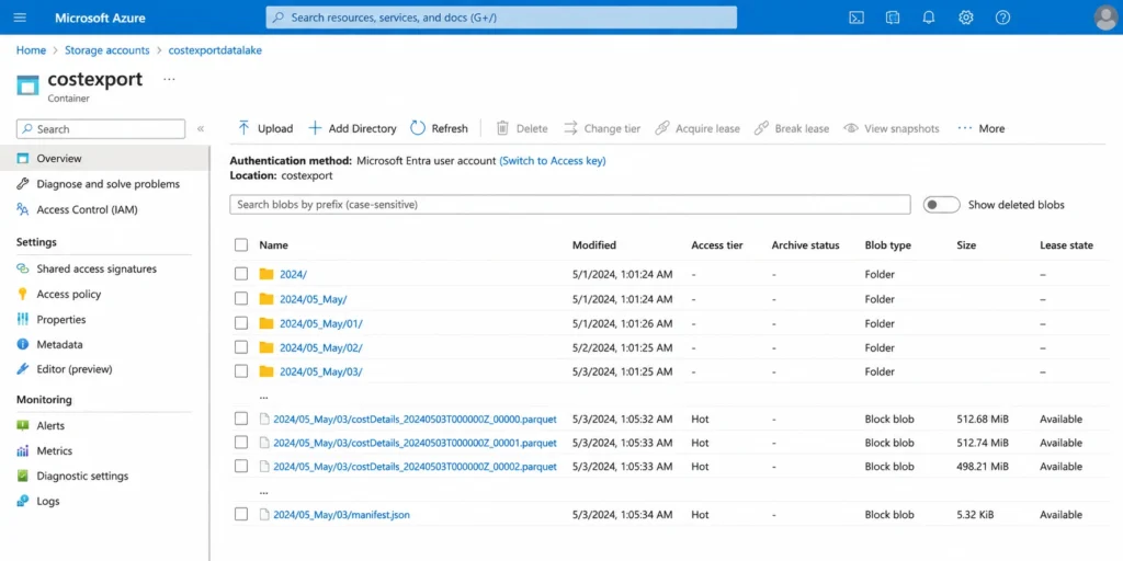
- Storage: select the target Subscription, Storage Account, Blob Container, and Directory path

Step 6: Click Create
Azure will begin delivering cost data files to your specified storage location on the schedule you configured. The first export can take up to 24 hours to appear, and Microsoft runs a second correction pass within 72 hours after a calendar month closes to capture late-arriving charges, so the very first day of a new month’s data should be treated as provisional until that correction pass completes.
What to do if this doesn’t work: the most common failure is an AuthorizationFailed error, which almost always means the signed-in account lacks Owner or Contributor rights on either the billing scope or the target storage account. Confirm both permissions independently. Write permissions on the storage account are required separately from permissions on the export itself.
How do you know it worked: navigate to your configured Blob Storage container after the first scheduled run completes. You should see a new CSV or Parquet file matching your chosen export type and time frame. If the container is empty after 24 hours on a daily export, recheck the storage account firewall settings and confirm trusted Azure service access is enabled.
A note on security and access control: exported cost data includes resource names, tags, and spend figures at a granularity most organizations treat as sensitive, even if it isn’t customer data. Scope access to the destination storage container using Azure RBAC rather than shared account keys wherever possible, and enable encryption at rest, which Azure Storage provides by default. If the export needs to cross a compliance boundary, such as a storage account behind a firewall for a regulated business unit, configure that firewall exception during export creation rather than after the fact, since exports created against a misconfigured firewall fail silently rather than raising an alert.
Turning Exported Data Into a Power BI Dashboard
Once cost data is landing in Blob Storage on schedule, the remaining work happens in Power BI. This is the step that turns a folder of CSV files into something an executive opens and understands immediately. The same exported files work equally well as input to Tableau, Looker, or any BI tool that can read CSV, Parquet, or a Blob Storage connection; Power BI is used here because of its native, first-party connector to Azure Blob Storage, which removes a setup step the other tools require.
Connecting Blob Storage to Power BI Desktop
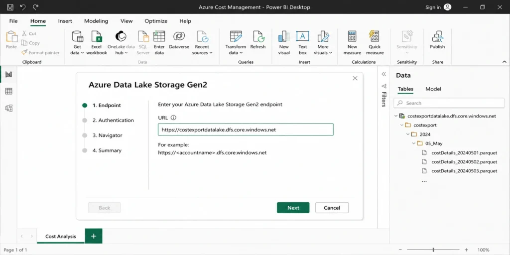
Power BI Desktop connects to Azure Blob Storage as a native data source. From Power BI Desktop, select Get Data, choose Azure Blob Storage, and authenticate with either an account key or a Shared Access Signature scoped to the container holding your exports. Once connected, Power BI can read the CSV or Parquet files directly, and a scheduled refresh in the Power BI service keeps the dashboard current as new export files arrive.

Power Query Transformation Basics
Raw export files rarely arrive dashboard-ready. Power Query, Power BI’s built-in transformation engine, handles the cleanup:
- Column typing: cost columns often import as text; explicitly set them to decimal number type before building any visuals, or your totals will silently be wrong.
- Date parsing: Azure export date fields need to be split or parsed into a proper Date type to support month-over-month grouping.
- Filtering out zero-cost rows: usage exports include free-tier and zero-cost line items that add noise without adding insight; filter these out at the query level rather than in the visual layer.
- Merging with a tag-to-business-unit mapping table: if your tagging strategy assigns a CostCenter tag, merge that against a lookup table mapping cost centers to human-readable business unit names, since executives don’t think in tag values.
Once the query layer is clean, a small set of DAX measures does most of the remaining work. A month-over-month delta measure, for example, typically looks something like:
MoM Change % =DIVIDE(
[Total Spend This Month] – [Total Spend Last Month],
[Total Spend Last Month]
)
That single measure powers the percentage delta on the executive KPI card and the automated callout describing what changed. Keep the underlying DAX simple and well-commented, since the person maintaining this dashboard in eighteen months is unlikely to be the person who built it.
On refresh scheduling: per Microsoft’s own Power BI documentation, Power BI service supports up to eight scheduled refreshes per day on Pro (shared capacity) licensing and up to 48 on Premium or Fabric capacity. For a daily export arriving each morning, a single daily refresh scheduled shortly after the expected file arrival time is sufficient; scheduling more frequent refreshes than your export cadence just burns refresh capacity without surfacing any new data.
Building the Executive View
The dashboard itself should stay to three or four visuals maximum on the primary page:
- A single large number: total spend this month against last month, with a percentage delta
- A trend line: the last twelve months of Amortized Cost, so seasonal patterns and step-changes are visible at a glance
- A breakdown by business unit or product line (using the tag-mapping table from Power Query)
- A callout box or KPI card flagging the single largest month-over-month change and which service drove it

A Worked Example
Consider an organization with roughly $180,000 per month in Azure spend across three subscriptions, illustrative figures only. A daily Amortized Cost export lands a new file in Blob Storage each morning. Power BI’s scheduled refresh picks up the new file at 6 a.m., and by the time the FinOps lead opens their laptop, the dashboard reflects yesterday’s spend, tagged and split across the four product lines that share the billing account. The month-over-month callout that week flags a 14% increase in one business unit’s spend, driven by a new set of GPU-backed VMs spun up for a proof of concept.
That single callout, generated automatically from the export-to-dashboard pipeline, turns into a five-minute conversation instead of a mystery someone has to manually dig into three weeks later during invoice reconciliation. Without the pipeline, the same 14% increase would typically surface only when the monthly invoice arrives, well after the proof of concept has either shipped or quietly kept running unattended. With the pipeline, the FinOps lead can ask the specific question, “is this proof of concept still active,” on day two of the spend increase rather than day thirty, which is the entire practical value of moving from a monthly invoice review to a daily automated dashboard.
Verify all current Azure pricing and service details at azure.microsoft.com, since rates and service names change.
What Belongs on an Executive Cost Dashboard
Not every metric Cost Analysis can show you belongs on the version leadership sees. Here’s a working table for deciding what makes the cut.
| Metric | Include on Executive View? | Why |
| Total monthly spend vs. prior month | Yes | The single number everyone wants first |
| Spend by business unit or product line | Yes | Ties cost directly to organizational accountability |
| Twelve-month trend | Yes | Shows seasonality and step-changes, prevents overreaction to normal variance |
| Spend by individual resource group | No | Too granular; belongs on an engineering-facing drill-down page, not the summary view |
| Reservation and Savings Plan utilization rate | Yes, as a single summary percentage | Shows whether committed discounts are being fully captured, without requiring the viewer to understand commitment mechanics |
| Per-meter billing detail | No | Reserve for the engineering troubleshooting view, not the executive summary |
| Forecast vs. budget | Yes | Directly answers “are we on track” without further explanation needed |
The pattern across every “yes” row: it answers a question an executive would actually ask out loud. The pattern across every “no” row: it answers a question an engineer needs to debug something, which belongs on a separate, deeper page in the same Power BI report rather than the front page.
How Azure’s Export Workflow Compares to AWS
Teams running both clouds often assume the export-to-dashboard pattern transfers directly between Azure and AWS. Most of it does, but a few structural differences are worth knowing before you build a dashboard meant to blend both.
| Dimension | Azure Cost Management Exports | AWS Cost and Usage Reports (CUR) |
| Native destination | Azure Storage (Blob) | Amazon S3 |
| Cost view options | Actual, Amortized, Usage | Unblended, Blended, Amortized |
| Native BI integration | Power BI (first-party connector) | QuickSight (first-party), or third-party BI |
| Standardized schema option | FOCUS | FOCUS |
| Native cost data API refresh | Up to every 4 hours via the Cost Details API | Refreshes at least once every 24 hours, per AWS’s own Cost Explorer documentation |
The practical implication: a genuinely unified multi-cloud dashboard is easiest to build on top of the FOCUS format on both sides, since it avoids writing separate transformation logic for Azure’s “Amortized Cost” naming versus AWS’s own amortized cost terminology, which use overlapping concepts but different column names and file structures underneath. Teams that skip FOCUS and build two parallel, hand-mapped pipelines instead tend to find the two pipelines drift out of sync with each other every time either provider updates their export schema. GCP’s Cost Table export to BigQuery follows the same underlying pattern (a scheduled, granular cost dataset landing in cloud storage for BI ingestion) and also supports FOCUS, so a three-cloud dashboard built on FOCUS across Azure, AWS, and GCP avoids three separate schemas rather than two.
Azure Cost Management Best Practices for Exports and Dashboards
A few operational habits separate a dashboard that stays accurate from one that quietly drifts wrong within a quarter.
Tag before you export, not after. Cost allocation tags applied retroactively don’t backfill historical export data cleanly. Establish a tagging taxonomy (CostCenter, Environment, Product) before your first export run, since untagged historical spend has to be manually reconciled later, and that reconciliation work compounds every month you delay it. One specific trap worth knowing: Azure resources don’t automatically inherit tags from their parent resource group or subscription, so tagging only at the resource group level still leaves individual resources untagged in your cost exports.
Match export frequency to how often the dashboard is actually reviewed. A daily export feeding a dashboard that leadership only opens monthly wastes storage and refreshes compute without adding value. A monthly export feeding a dashboard that engineering checks daily leaves them working from stale data for weeks at a time.
Use Amortized Cost for trend views, Actual Cost for reconciliation, and keep both exports running in parallel. Since these serve genuinely different audiences and questions, running only one leaves a gap for whichever audience isn’t being served.
Respect Azure’s data retention limits when planning long-term trend views. Azure Cost Management retains detailed cost data for up to 13 months directly in the portal, and Enterprise Agreement customers can access up to 36 months through the EA portal. If your executive dashboard needs a multi-year trend, the export-to-storage pipeline is not optional. It’s the only way to retain cost history beyond Azure’s native retention window, since your own storage account has no such time limit.
Audit your storage account’s firewall configuration before troubleshooting anything else. A surprising share of “my export isn’t showing up” support threads trace back to a storage account firewall silently rejecting the export write, rather than a configuration mistake in the export itself.
Separate the executive view from the engineering view in the same Power BI report, rather than building two separate reports. A single report with a summary page and a drill-down page keeps both audiences working from one underlying dataset and one refresh schedule, which avoids the two views quietly drifting apart from each other over time, a common problem when the executive dashboard and the engineering dashboard are built and maintained as entirely separate Power BI files.
Document who owns the export configuration itself. Exports are tied to the individual or service principal that created them, and if that account loses access or leaves the organization, the export can silently stop running with no alert generated. Assign export ownership to a role or service principal rather than an individual’s personal account wherever your organization’s access model allows it.
Verify current retention periods at learn.microsoft.com’s Cost Management + Billing documentation, since Microsoft periodically updates these limits.
Common Mistakes When Building Azure Cost Dashboards
Building on Actual Cost data without considering Amortized Cost. This is the single most common mistake, and it usually isn’t a deliberate choice; teams pick Actual Cost because it matches the invoice they’re used to reconciling, without stopping to consider that a dashboard has a different job than an invoice. The result is a dashboard that shows false spikes every time a commitment renews.
Treating the first dashboard as the final dashboard. The first version almost always includes too much. The instinct to show everything the export contains, since it’s all right there in the data, produces a dashboard that takes longer to read than the underlying spreadsheet did. Cut it down to the four visuals from the section above and add a drill-down page for anything else. This same instinct causes a second, longer-term problem at scale: a hand-built Power BI report with no consolidation logic behind it tends to stay a manual, single-point-in-time snapshot as an organization adds subscriptions, and if other teams or customers need their own view into the same data, someone has to rebuild or duplicate the report rather than extend it. Build the tag-mapping and consolidation logic in Power Query once, so adding a new subscription later means updating a filter, not rebuilding the report.
Forgetting that exports don’t retroactively apply to historical data. An export configured today starts capturing data from today forward. If you need last year’s cost history in your dashboard, that has to come from a one-time historical export run separately, using the “rerun an existing export job for a historical period” capability Azure provides specifically for this gap.
Assuming the dashboard fixes the underlying cost problem. A dashboard reports the number. It doesn’t purchase the correction. See the next section for what closes that gap.
Granting export creation permissions too broadly. Because Exports can be created by anyone with Contributor access to a scope, it’s common for an organization to end up with a dozen overlapping exports created by different engineers over time, each pointed at a slightly different storage location, none of them documented. Before building a new export, check whether one already exists for your scope using the Exports list view, since consolidating onto a single, well-documented export is easier than untangling five redundant ones a year later.
Every mistake above is fixable inside the export and dashboard configuration itself. The next one isn’t.
From Visibility to Action: What a Dashboard Can’t Fix by Itself
Here’s the uncomfortable part every cost management guide skips: a beautifully built Power BI dashboard shows you exactly how much you’re overpaying. It does not do anything about it. Native Azure tools push cost data to you on a schedule, at best every four hours through the Cost Details API according to Microsoft’s own guidance, but a number that refreshes faster still requires someone to look at it, notice the underutilized Reservation, and go purchase a correction. That gap between visibility and action is where most FinOps programs quietly leak money for months.
This is precisely the problem Usage.ai was built to close on Azure. Once your dashboard surfaces an underutilized Savings Plan or a Reservation that no longer matches your VM footprint, someone still has to size the correction, purchase it, and monitor it going forward, month after month, across every subscription in the billing account. Usage.ai automates that layer specifically.
Usage.ai Insured Flex Commitments are an SP/RI-equivalent discount structure delivering savings of 30 to 60% without requiring multi-year lock-in or upfront payment. Every commitment purchased through the platform is fully insured, and any underutilized portion is returned as cashback, not credits.
Usage.ai Insured Flex Commitments carry no multi-year lock-in. Commitments adjust quarterly. Scale down? No penalty. Underutilized? Cashback is paid in real money, not credits.
Once your dashboard reveals which subscription is carrying stranded commitment risk, this is what changes: instead of manually recalculating the right Reservation or Savings Plan size and hoping usage doesn’t shift again next quarter, Usage.ai’s Autopilot handles the ongoing sizing, purchasing, and rebalancing automatically, reading only at the billing layer with no infrastructure changes required. If you want to see how Azure Savings Plans and Reserved Instances work as the underlying discount mechanics your dashboard should be tracking, Usage.ai’s Azure Savings Plans glossary entry breaks down exactly how the commitment mechanics work and how they differ from Reservations.
| Approach | Lock-In Terms | What Happens on Underutilization | Refresh Cycle |
| Native Azure Advisor recommendations | N/A, recommendations only | No buyback; financial exposure stays on your books | Recommendations refresh periodically, but purchasing is manual |
| Typical rigid commitment tools | 1 to 3 year lock-in | Credits only, if anything | Varies by vendor |
| Usage.ai Insured Flex Commitments | No multi-year lock-in, quarterly adjustment | Cashback in real money via buyback guarantee | 24-hour recommendation refresh via Autopilot |
The dashboard you just built tells you where the problem is. Closing that gap month over month, without someone manually re-running the numbers every quarter, is what Usage.ai’s Azure commitment management strategy is built to automate. Setup takes about 30 minutes, requires no infrastructure changes, and Usage.ai only gets paid a percentage of realized savings, meaning if it doesn’t save you anything, you owe nothing.
Frequently Asked Questions
1. What is cloud cost management on Azure?
Cloud cost management on Azure means using Microsoft Cost Management + Billing to analyze, allocate, and optimize your Azure spend across subscriptions and resource groups. It combines cost analysis, budgets, tagging for allocation, and exports for custom reporting. The practice becomes effective once spend is both visible and acted upon, not just visible.
2. What is Azure Cost Management used for?
Azure Cost Management is used to track spend by resource, forecast future costs using historical trends, set budget alerts before overruns happen, and export raw cost data for custom analysis. It’s included free with every Azure subscription and works at the subscription, resource group, or management group scope.
3. How do you export Azure cost data to Power BI?
Configure a recurring export in Cost Management + Billing pointing to an Azure Storage account, choosing Amortized Cost for dashboard use. Then connect Power BI Desktop to that storage account using the Azure Blob Storage connector, transform the data in Power Query, and build your visuals from the cleaned dataset.
4. What’s the difference between Actual and Amortized cost exports?
Actual Cost shows charges exactly as billed, with upfront reservation costs appearing entirely in the month purchased. Amortized Cost spreads those upfront costs evenly across the commitment term instead. Use Actual Cost for invoice reconciliation and Amortized Cost for trend dashboards, since amortized data avoids false monthly spikes.
5. How long does Azure retain cost data?
Azure Cost Management retains detailed cost data for up to 13 months directly in the portal for most subscription types. Enterprise Agreement customers can access up to 36 months of history through the EA portal. Verify current limits at Microsoft’s documentation, since retention periods are updated periodically. For longer retention or multi-year trend dashboards, a scheduled export to your own storage account is required.
6. What is the FOCUS format and why does it matter?
FOCUS, the FinOps Open Cost and Usage Specification, is an open standard schema for cost and usage data across cloud providers. It matters specifically when a dashboard needs to blend Azure spend with AWS or GCP spend in one unified view, since it removes the need to manually map each provider’s proprietary column names into a common structure.
7. How often should cost exports run for an executive dashboard?
Daily exports are recommended if the dashboard will be checked by engineering or FinOps teams more than once a week, since it keeps the underlying data current. Monthly exports are sufficient if the dashboard is only reviewed in monthly or quarterly leadership meetings, where daily granularity adds cost and complexity without adding value.
8. Does running Azure Cost Management exports cost extra money?
The export feature itself is free. What you pay for is the underlying Azure Storage account holding the files, typically a small blob storage cost based on data volume and retention, usually a minor line item relative to overall Azure spend. Verify current Azure Storage pricing at Microsoft’s pricing page, since rates vary by redundancy tier and region.
9. Can I use Synapse or Databricks instead of Power BI for the dashboard?
Yes. Azure Cost Management Exports deliver the same CSV or Parquet files regardless of destination, and both Synapse and Databricks can ingest them directly from Blob Storage. Power BI is the more common choice for an executive-facing dashboard specifically because of its native, first-party Blob Storage connector; Synapse and Databricks are typically better suited when the cost data needs to join large-scale engineering datasets rather than feed a standalone report.